Read time: 4 minutes
Today’s Newsletter is brought to you by:
Why Your Content Gets Likes But No Leads
You're probably missing one of these three content types. Here's what actually drives inbound (9-min video).
Most carousels are generic. And generic gets ignored.
But if you've read the Q3 algorithm report, you know carousels are the best performing format on LinkedIn - 4x the reach of text posts because they rack up a lot of dwell time.
They're one of the best top-of-funnel tools you have.
But the gap between an average carousel and one that takes off is absolutely massive. My best carousels get >1,000,000 views, my worst get ~20,000.
Here's what I’ve found separates the best from the rest.
The Problem With Carousels
Most carousels don't fail on slide 5, they fail on the front cover. If slide 1 doesn't stop the scroll, you can write the best actionable advice in the world but no one will see it.
As I've gotten better and better at creating content, I now spend more and more time on the front cover. That's always what I'm tweaking until the very end.
Your readers have shockingly little patience. You've got less than 1 second to make someone think "wait, I need this."
Most covers don't pass that test. They're generic - no real hook or tension, nothing that stops the scroll.
The Formula For Great Carousels
1. Nail The Front Cover
Your cover has one job: stop the scroll. Here are four things that can do that:
Pattern interrupt. Something visually unexpected - bold color, handwritten text, an image that doesn't belong - anything that stands out on the feed. For example, this carousel performed well because my Goldman Sachs ID card was on the front cover.
Identity trigger. Name your readers in the title. "5 mistakes first-time founders make" calls out a clearer audience than "leadership lessons."
Big promise. Make it specific and concrete so not "write better posts" but "How to write personal stories on LinkedIn."
When it comes to promises, you want to offer the most value with the least amount of work. So phrases like "small habits" or "do this in 5 minutes" imply this will be little work for the reader.
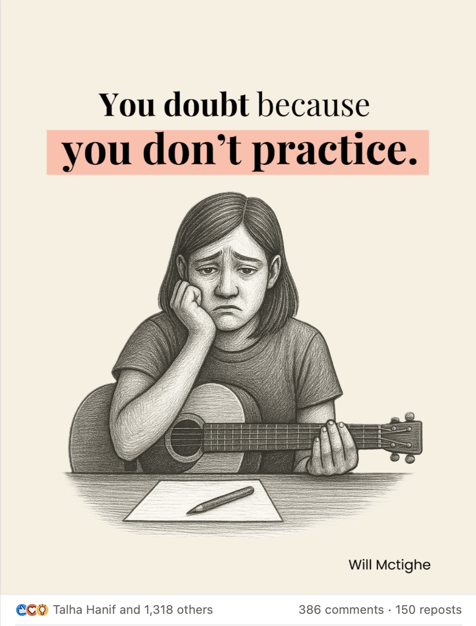
Contrarian take. Challenge something they believe. An example of this is "You overthink because you don't write."
2. Earn Every Swipe
Your cover gets people in the door, then each slide has to earn the next swipe.
The first 3-4 slides are everything. If you lose them there, they're gone. Every slide needs a small "aha" - one clear insight that makes them think "okay, what's next?"
“Aha” moments come from people reading something - typically the title on each slide - and thinking “aha that’s so true, I hadn’t thought of that”.
I generally keep it to one idea per slide.
3. Design Like A Billboard
I generally recommend 2 fonts maximum, one for headlines, one for body text and 2-3 colors against white or light gray background. I have two simple templates that I use over and over again and adapt to each topic.
Think billboard on a highway. You have less than 3 seconds to communicate the message.

4. Use These Proven Formats
Here are three carousel formats that work for any topic or niche:
The Big Promise (Shows transformation) - How to Create Beautiful Infographics in 5 Minutes or 30 LinkedIn Post Ideas in 5 Minutes
Old Way Vs. New Way (Challenges thinking) - Old LinkedIn Vs. New LinkedIn
Do’s and Don’ts (Actionable and highlights contrast) - Content Design Dos And Don’ts
Why This Works
Carousels aren't about information density. They're about cognitive ease.
Your reader's brain is looking for an excuse to scroll past. Don't give them one.
Make a big promise on your front cover. Give them an aha moment on each slide.
Stack enough of these small things and you've got something people will save.
See you next week,
Will
P.S. We launched a Carousel Generator earlier this month. Here’s a quick video on how it works. Sign up for the waitlist for the next cohort.

Will McTighe
Forwarded this email? Sign Up Here
Connect with me on LinkedIn | YouTube | Instagram
P.P.S. Building a personal brand was the highest leverage thing I’ve done in my career. Whenever you’re ready, there are three ways I can help you:
Enterprise LinkedIn Systems – I work with enterprise clients ($10M+ in revenue or Series A+) on building and running your entire LinkedIn content-led GTM system. If this is you, apply here.
Trying out Saywhat: My software platform and community for solopreneurs, consultants and coaches.
Cheat Sheets (Worth $200): Here are my 60+ LinkedIn Cheat Sheets.

