Read time: 4 minutes
Today’s Newsletter is brought to you by:
30 LinkedIn Post Ideas in 8 Minutes
A lot of people struggle coming up with what to post about. In this 8-min video, I break down how to come up with 30 post ideas in one sitting.
When I started posting on LinkedIn in early 2024, one thing became obvious fast:
Visual assets (infographics & carousels) are key to growing your followers.
Why? Well, for a start, they get lots of saves and reposts because they are useful and make the reader look smart.
Saves and reposts are two very important signals for the LinkedIn algorithm that your content should be shared with more people. So if you want to grow as fast as possible, mastering visual content is a massive unlock.
But here's the problem: most infographics I see on LinkedIn are terrible.
Why Most Infographics Flop
For better or worse, I've probably consumed more infographics over the last two years than 99.9% of people on LinkedIn.
Most that I see flop make a few core mistakes:
Tiny, unclear titles
If someone can't understand your headline in half a second while scrolling, you've already lost them.
No visual signposting
Visual signposting is telling the reader where to look. You can use things like big headers, numbering, or bold text to guide people's eyes through the content. If they don't know where to look, they'll just give up and scroll on.
They're not pretty
For example, clashing colors, random icons, uneven spacing and too much crammed into one image. People instinctively trust things that look pretty. If your infographics aren't, your audience is less likely to stop and read them.
Winning Examples
Let me show you what good looks like.
Job interview cheat sheet - 136,397 likes
How to fix work conversations - 39,418 likes
Oyo Mafia - 4,226 likes
Notice what they have in common:
Big bold titles you can understand instantly, clean color schemes, and information broken into digestible chunks.
These aren't complicated designs. They're just following a few simple rules that most people ignore.
So why doesn't everyone make infographics like this?
Because they're an absolute nightmare to create.
Even knowing exactly what works, I still spend way too long making them. And I hear it from creators every single week: they know infographics perform better, but the moment they open Canva it becomes a 4-hour project.
For a long time, this was the single biggest pain point Saywhat users mentioned to me.
So we decided to fix it.
A Faster Way: Infographics in Under 2 Minutes
Being frank, a big part of my edge as a creator has been my visuals. Launching a product that gives everyone the ability to make beautiful visuals weakens my edge.
But I'd rather everyone have a shot at winning on LinkedIn than protect my advantage. I'll just have to keep innovating.
So we built it anyway. The first infographics generator specifically for LinkedIn.
You write. Saywhat turns it into a clean, on-brand infographic in under two minutes.
Our early users have been using it since Monday and I've never received this much positive feedback on anything I’ve ever built! It has been nuts!
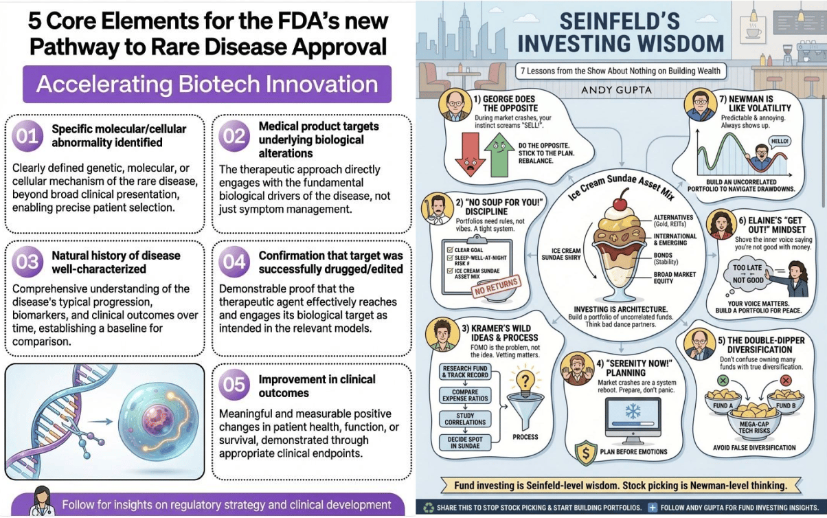
Here are a couple of examples of what they've made:

For our launch week, the Infographics Generator is available inside Saywhat’s Executive plan. We started with 100 spots - 44 left. You can try it free for 7 days:
Once those remaining slots fill, we’ll close access until the next cohort.
We’re staggering access because this feature is unbelievably powerful - and we want early adopters to have the full advantage before we open it more widely within the Exec tier.
This is your chance to get in early on something that's about to become a major advantage on LinkedIn.
See you next week,
Will
P.S. One early user told me: “It’s a no brainer unless you enjoy doing hard things and suffering because it’s a character building exercise”. More on that below:


